Last week, I published a visualisation of publicly available earthquake data. I wanted to follow it up with a technical blog that would cover off some of how I made it, and what I learned.
You can check out the visualisation here, or if you prefer, you can just sally on over to GitHub and check out my code.
Getting the data from GeoNet
I built this visualisation using the GeoNet API, which was a learning experience in itself. I’m not going to go into the CORS drama I had, except to say a big thank-you to Tim for having my back.
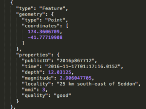
The Geonet API serves up a geoJSON object containing details of the last 100 quakes detected. So you know what I was working with, here’s an example of one of the earthquake objects:
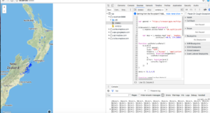
The visualisation is made up of two components. The chart on the left is a D3 visualisation generated onto an svg canvas, which is linked up via some slightly hacky trickery to the map on the right, for which I used the Mapbox GL JS API. Let’s start with the map, because that’s where I started:
Mapbox, but not as I knew it
I decided to use Mapbox because I’ve had pleasant experiences with it in the past, but this time I used their new GL framework. Mapbox GL renders maps on the client-side at a super high frame rate, and comes with lots of cool features like full customisation and fancypants styling options. With no distinction between baselayers and overlay layers; everything on the map is loaded as vectors in the browser. Ooh la la!
MapboxGL is rad and very, very beautiful, but as I’d chosen it for its familiarity, I was thrown by some of the changes. The Mapbox I knew of old was a Leaflet plugin, with additional functionality to make life more fun. I selected the GL API on a whim, without bothering to read the full documentation before I began.
Lesson 1: always read the documentation. Taking half an hour to skim-read a few pages of docs can save you 3+ hours of enraged foot-stomping, balled fists and tears, not to mention emergency 10pm Burger King shame. In this case, the crucial piece of information was only three paragraphs deep in the Mapbox GL JS Fundamentals: unlike ye olde Mapbox of my halcyon days, which handled coordinates in the normatively phrased “latitude and longitude” order, Mapbox GL JS expects the coordinates to arrive in longitude-latitude order.
In fairness, every geospatial format (including geoJSON) and the convention of the x and y axis in graphing list the longitude value first. Nevertheless, this tripped me up good and proper and wasted several hours of my time in searching for a bug that was in fact just a simple .reverse() burrowed in where it wasn’t needed.
Once I had the map up and running, it was time to get to work on the D3 component.
Hello D3, my old friend
To quote myself: “D3 generates DOM elements to represent each piece of the data in the set you provide and binds a datum to each one. Once the datum is bound to the element, you can use it to boss the element around; move it and style it in response to the value.”
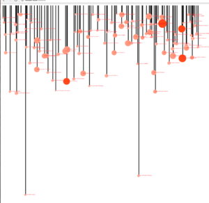
I set about writing the code that would generate svgs to represent the depth and magnitude of each quake just like I did in my solar system blog. Note that to make these lollipops I’ve actually created two charts on top of each other; a scatter plot of blobs, and a bar chart of rectangles.

Not very inspiring yet. I used the index number of each item in the quakes array to spread the quakes out along the x-axis so that they weren’t all lumped on top of one another, but this wasn’t representative of the timescale the quakes occurred on. Time for lesson 2: how to create dynamic scales in D3.
The Geonet API, as I mentioned, delivers a data object containing only the most recent 100 quakes (above magnitude 2, as I set the query parameter to filter out baby earthfarts). I’ve left the object lurking in the console, if you’d like to go look at it. This means that setting the scales for the visualisation’s x-axis was problematic. How long should I make the time scale? Sometimes the API would serve up 100 quakes that had occurred within the last 12 hours, but on other days I would have 48 hours’ worth of data to play with. How to set the time axis so that all the quakes were present, without a big ol’ historical gap opening up on quake-intensive days?
I soon noticed a similar problem with the depth axis. A nice big quake just North of White Island was 180 km deep, and vanished right off the bottom of my chart, invisible to viewers (a sad loss, because it was quite majestic). If I increased the length of the axis to be inclusive of these deep-belly rumbles, I forced 95% of the other quakes into a lumpy paste, smeared along the time axis, indistinguishable and difficult to read. The vast majority of the quakes are between 5 and 50km underground; why squish them all together just to be inclusive of the occasional outlier?
D3 has the answer, in the form of its scale functions. These are incredibly cool; here is how the scale function works for my x axis:

D3’s scale functions map an input domain to an output range. You need to tell your .domain() function the minimum and maximum values of your data, and it will map them to the range you specified to the .range() function. You can make your input domain respond to the values present in your data, so that if your data is constantly changing, your axes will render in response to the minimum and maximum values. Using this method, my timescales could be flexible and responsive to the input data, the minimum value of my domain is the date property of the first object in an array of earthquakes, and the maximum value is the point in time that the code executes. After adding these scale and axis functions, my chart looked like this:

I then used the scale() function to set up the colour and radius of the circles on the chart; the circles’ fill colour is generated from a scale function that takes the min and max magnitudes from the 100 earthquakes and maps them to a range between two hex values.
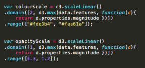
Now, my visualisation looked something like this:
Bringing it all to life
Now to lay the D3 visualisation over the top of the map, and link them together so that the functionality interacts. To do this, I added a mouseover function to the method chain that creates the circles, and gave it an anonymous function to perform that passed the data object for the circle in question over to Mapbox, and generated a popup pointing to the relevant coordinates. So when you mouse over a circle in the D3 visualisation, a popup appears on the map telling you the magnitude, location and time of the quake.


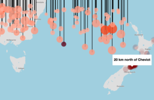
Success!
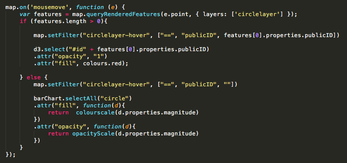
Now I needed to reverse this process, so that a mouse hovering over a dot on the map would trigger the d3 visualisation to highlight the correct circle on the depth/time matrix.
Mapbox GL makes it easy to mark out earthquakes on a map by passing the data object containing the quakes into an addLayer() function. This addLayer function has the ability to style the circles in response to the data, much like d3, but I decided to leave them all uniform to avoid information overload for users, and highlight them on mouseover instead. This was another challenge; Unlike pin-drops on a Leaflet map, data points on a Mapbox GL layer are not objects you can simply summon by ID.
Luckily, Mapbox had a solution, although I found it a bit hacky and would probably try to find a different method if I were beginning this project again: a .queryRenderedFeatures() function, which you can call when a user is moving their mouse over the map. Most of the time this function just returns an empty array, until the user mouses over a circle and a data object pops up in the array. Inside the object I found the quake’s publicID, which I could use to highlight the corresponding quake on the D3 chart using jQuery.
With all the functionality in place I was ready to style it up and get it up online. More thanks to Tim for sorting out the hosting, (and Barry for being good natured about it). And thanks to everyone who’s commented and emailed me with questions, suggestions and links to other cool visualisations! It’s great to have feedback while I’m learning, and the engagement is so encouraging, I really appreciate it.
Data is beautiful – Sarah

